Standardized Title Screen
One of sources of user enjoyment is consistency. Being able to predict what something will do or look like, and then having it actually turn out that way, is very satisfying.
By contrast, one of the pain points of user experience is surprises. When an action or command that has previously done one thing but now results in another, the result is unpleasantly jarring, after which the user can feel resentful at being "tricked" and at the hassle of having to learn or look for something that is unnecessarily different and inconsistent.
We all remember being annoyed when a software update changes the look and feel of an app or OS. Or when different apps have different conventions on where to find various things.
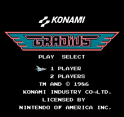
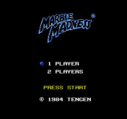
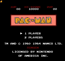
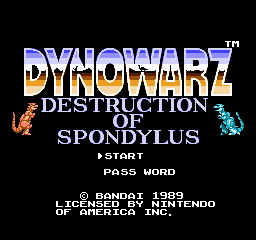
This principle applies to many categories of things. Right now, though, I'm bringing it up in just one specific context: the title screen of video games. One of the things I most liked about the original Nintendo Entertainment System user experience, at least in its early years, was how the title screens had such a consistent look and feel. I made the world of the NES feel reassuringly well-organized, well-thought-out, and friendly.
I'm not saying every NES title screen had the same layout - there certainly was variety, especially in the later years. And that variety isn't purely bad. But I really think that X16 apps (OK, games) having a standard layout much like the NES had, with high scores on top, a colorful title (probably with a distinctive font or logo, perhaps with some graphics), one or two player being displayed options, and then some copyright info -- and all with a same font, with the same background color, etc., would really help tie it all together and make this project feel like something polished. Look here at several different publishers basically stuck to the same layout.
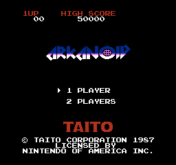
I suggest doing something like this, maybe even having a standard template to work from.
- svenvandevelde
- Posts: 488
- Joined: Wed Dec 23, 2020 6:30 am
- Location: Belgium, Antwerpen
Standardized Title Screen
Yeah. I see, it is good practice and gives the player a recognition which groups are behind sets of games. There are many more examples like the ones you've posted.
- JimmyDansbo
- Posts: 476
- Joined: Sun Apr 26, 2020 8:10 pm
- Location: Denmark
- Contact:
Standardized Title Screen
I would say that it is close to impossible to make homebrew hackers and hobbyists conform to such a standard.
It may be possible to see something similar if a group of people go together to create a bunch of titles for the CX16.
Visit my Github repo
or my personal site with CX16/C64/6502 related information.
Feel free to contact me regarding any of my projects or even about meeting up somewhere near Denmark
or my personal site with CX16/C64/6502 related information.
Feel free to contact me regarding any of my projects or even about meeting up somewhere near Denmark
Standardized Title Screen
You're worried about consistency of the splash page? With hobbyists and amateurs like me?
- svenvandevelde
- Posts: 488
- Joined: Wed Dec 23, 2020 6:30 am
- Location: Belgium, Antwerpen
- desertfish
- Posts: 1096
- Joined: Tue Aug 25, 2020 8:27 pm
- Location: Netherlands
Standardized Title Screen
I know a great amount of games I had on the C64 had a standardized start screen!
Here it is!
?
Standardized Title Screen
On 9/13/2022 at 12:22 PM, desertfish said:
Don't get me started on how much I hate intros and cracktros. What's worse is the new trend of "cracking" and adding intros to free and unprotected games. What's the point of that?
- svenvandevelde
- Posts: 488
- Joined: Wed Dec 23, 2020 6:30 am
- Location: Belgium, Antwerpen
Standardized Title Screen
True. The effort these crackers put in making intros or demos should be better spent on making good games.
-
- Posts: 913
- Joined: Tue Apr 28, 2020 2:45 am
Standardized Title Screen
The best way to have consistency is to start a company and pay people to follow a template. I think the greatest thing about the X16 is the flexibility it provides homebrew developers while still having the immediacy of a simple 8-bit system. Giving them an arbitrary box to sit in is not going to work. It's like trying to get a picture of your cat in a box. He'll just hop out and wander away, and then come back and sleep in the thing all night when the camera isn't there.
Standardized Title Screen
On 9/14/2022 at 2:28 AM, svenvandevelde said:
The effort these crackers put in making intros or demos should be better spent on making good games.
I'm fine with demos, sometimes they evolve into games etc. But I fully agree on cracktros... I hated them.
As for standardised title screens: Not sure about that. I think I'd prefer to keep my individual and artistic freedoms to do whatever I think is suitable for each game or software. Maybe I would settle to a certain standard of my own over time.
For Bixx for example the title screen and options/instructions are one screen. For Invaderz I opted for a separate title screen and another screen for instructions/options because there wasn't enough space for both on one - and I wanted to show off the graphics I created (and what the X16 can do).