One of sources of user enjoyment is consistency. Being able to predict what something will do or look like, and then having it actually turn out that way, is very satisfying.
By contrast, one of the pain points of user experience is surprises. When an action or command that has previously done one thing but now results in another, the result is unpleasantly jarring, after which the user can feel resentful at being "tricked" and at the hassle of having to learn or look for something that is unnecessarily different and inconsistent.
We all remember being annoyed when a software update changes the look and feel of an app or OS. Or when different apps have different conventions on where to find various things.
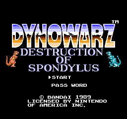
This principle applies to many categories of things. Right now, though, I'm bringing it up in just one specific context: the title screen of video games. One of the things I most liked about the original Nintendo Entertainment System user experience, at least in its early years, was how the title screens had such a consistent look and feel. I made the world of the NES feel reassuringly well-organized, well-thought-out, and friendly.
I'm not saying every NES title screen had the same layout - there certainly was variety, especially in the later years. And that variety isn't purely bad. But I really think that X16 apps (OK, games) having a standard layout much like the NES had, with high scores on top, a colorful title (probably with a distinctive font or logo, perhaps with some graphics), one or two player being displayed options, and then some copyright info -- and all with a same font, with the same background color, etc., would really help tie it all together and make this project feel like something polished. Look here at several different publishers basically stuck to the same layout.
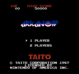
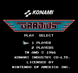
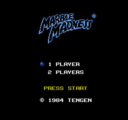
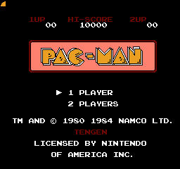
I suggest doing something like this, maybe even having a standard template to work from.


![[CSDb] - Fairlight Intro (the Legendary one) by Fairlight (1987)](https://external-content.duckduckgo.com/iu/?u=http%3A%2F%2Fcsdb.dk%2Fgfx%2Freleases%2F53000%2F53390.png&f=1&nofb=1)

